Wednesday, 12 January 2011
LOCATION SHOTS - Whilst filming for our soap trailer
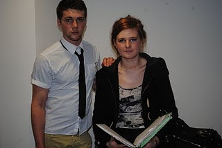
We took various location shots around our college whilst filming our soap trailer as we took in to account our exact genre. We needed to create the perfect genre for our soap and so we felt our own college was the best place for it as our soap was aimed at people just like us. Our location shots took place in corridors, classrooms (where our billboard was created) and outside the characters house.
Monday, 10 January 2011
Possible 'extra' photo's for our magazine front cover
I took the first photo of Lyndsey and directed her to be in a boy’s jacket with the hood up to indicate a thug like appearance. She carries this off well and I decided to use it on my front cover as it looks as though it could have come from a Soap on TV, whereas the other photo detracts away from the main photograph as there is 3 of them.
Monday, 3 January 2011
Practice pictures for Billboard
We wanted to create an enigma around our billboard image so the viewer would be asking question as to what was about to happen, but we also needed something that was suitable and fitting for our brand identity.
Our first idea was to screw up a piece of paper, like a secret love note and have it pinned on a notice board in a teachers office however, this became confusing as no characters were visible so it was hard for the viewer to understand what was going on.
We changed this but took ideas from it, as the principle was good. We chose to write 'Mr.M' on a noticeable classroom board, to highlight the idea that that male in the photograph is a teacher. The love hearts surrounding the writing suggest that the person who wrote it is immature, therefore pointing the finger at a student. This enigma attracts the reader to find out more about the image.
The images are sharp, and the angle is perfect as it is though someone is spying on Mr.Mead, the angles allow the viewer to see his facial expressions perfectly.
Subscribe to:
Comments (Atom)


